Anoosha Baxi
anoosha.baxi@gmail.com
Research
As a longtime fan of Saturday Night Live (SNL), I had already spent the majority of my life preparing for this project. In addition to my existing routine of watching the show every week, I reread Live From New York: The Complete, Uncensored History of Saturday Night Live as Told by Its Stars, Writers, and Guests, this time taking notes. It was also a great excuse to dig deep into some of the older episodes that I hadn’t seen before.
Goals
Peak (or reignite!) viewers’ interest in SNL.
Visually capture the essence of SNL while differentiating the visual language from the existing (and past) SNL identities.
Visualize both qualitative and quantitative data in a variety of interesting ways.
Data Visualization Ideation
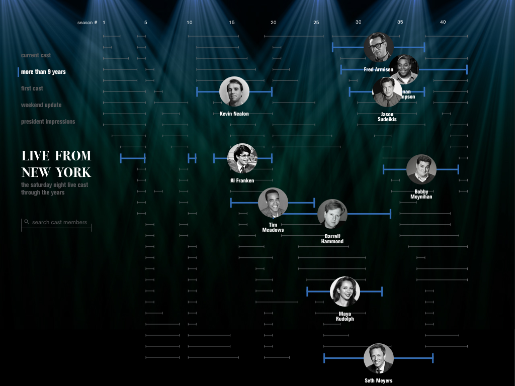
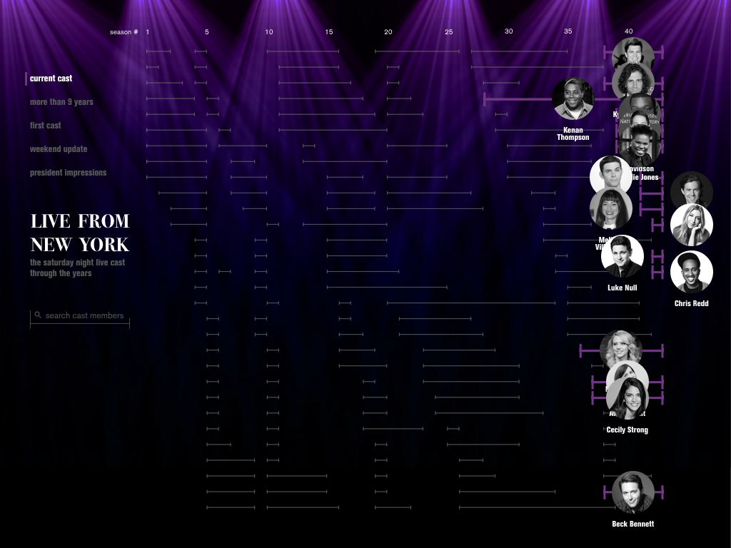
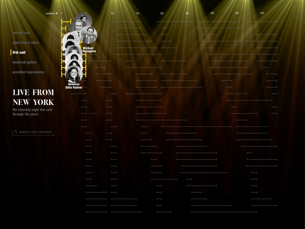
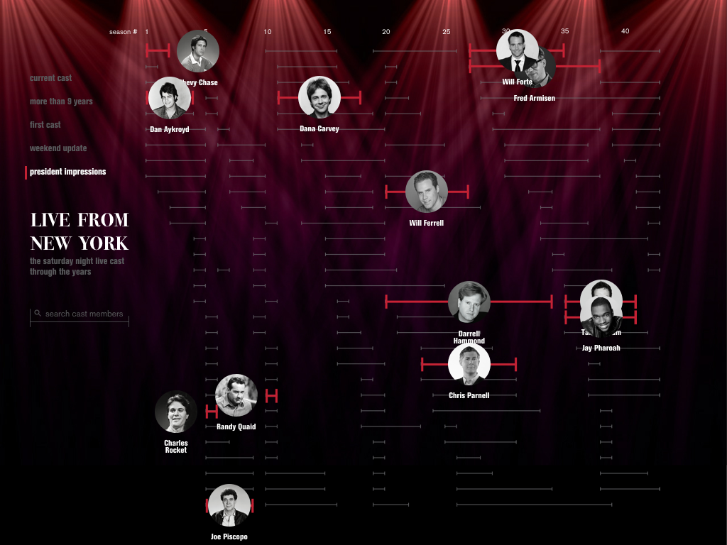
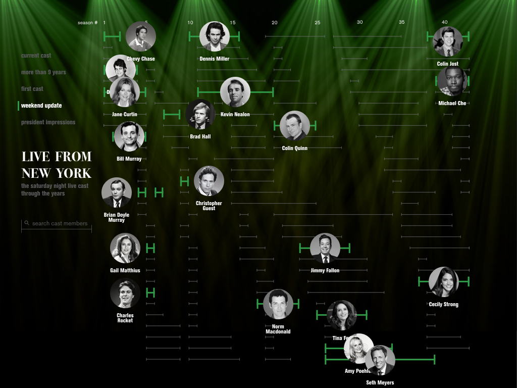
The first step was to play with the data and explore a variety of different data visualizations. This helped separate the most interesting information and narrow down the scope to a subtopic of SNL, the cast.
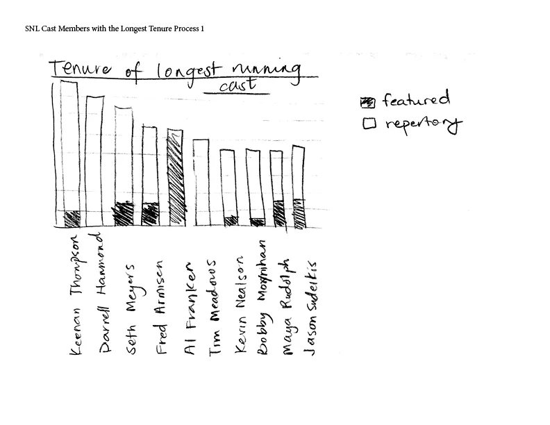


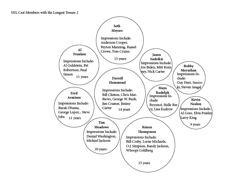

Infographic Iterations
The data visualizations were then refined further, put together onto a single composition, and evolved into my final infographic through iteration.


Final Infographic

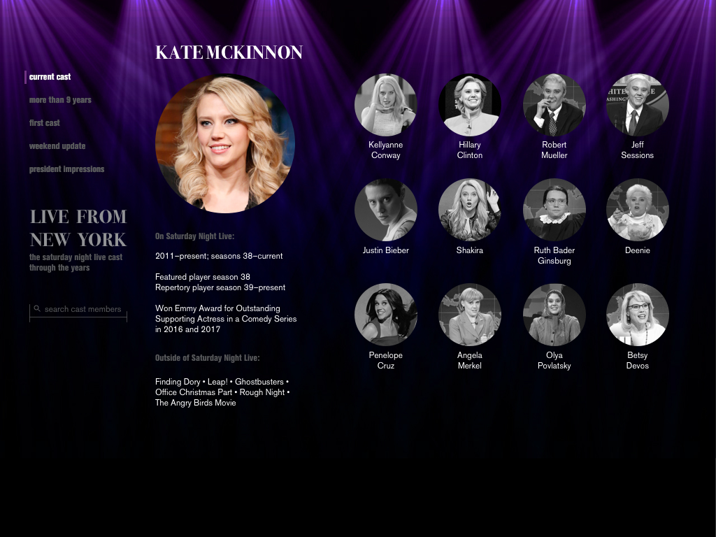
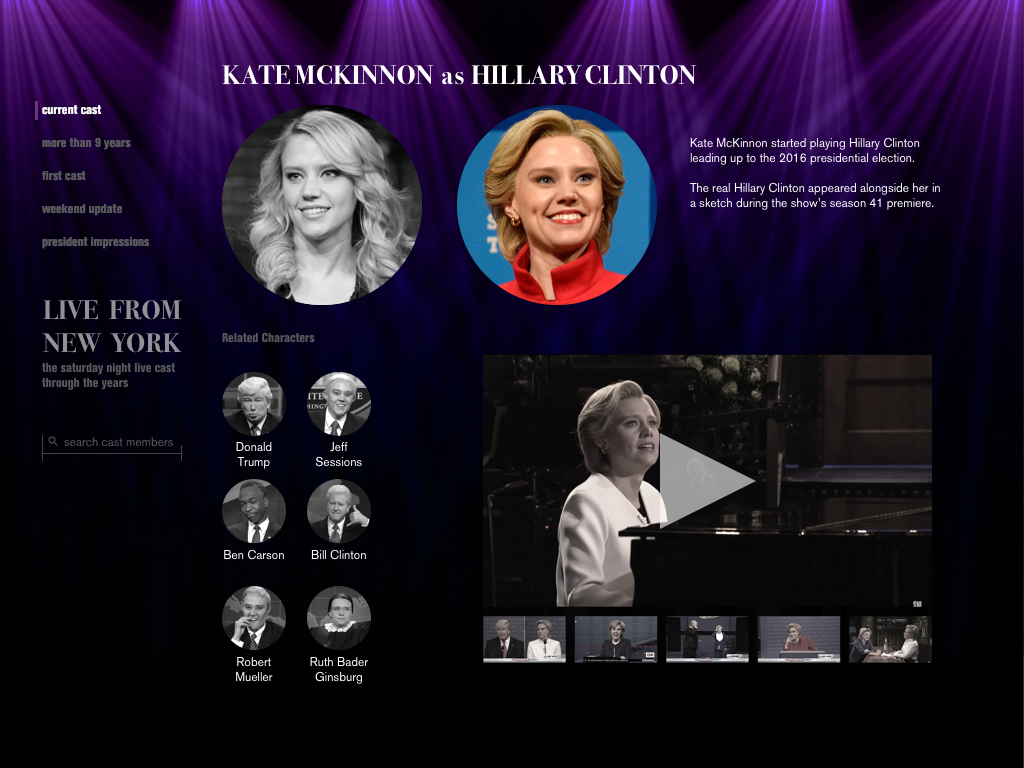
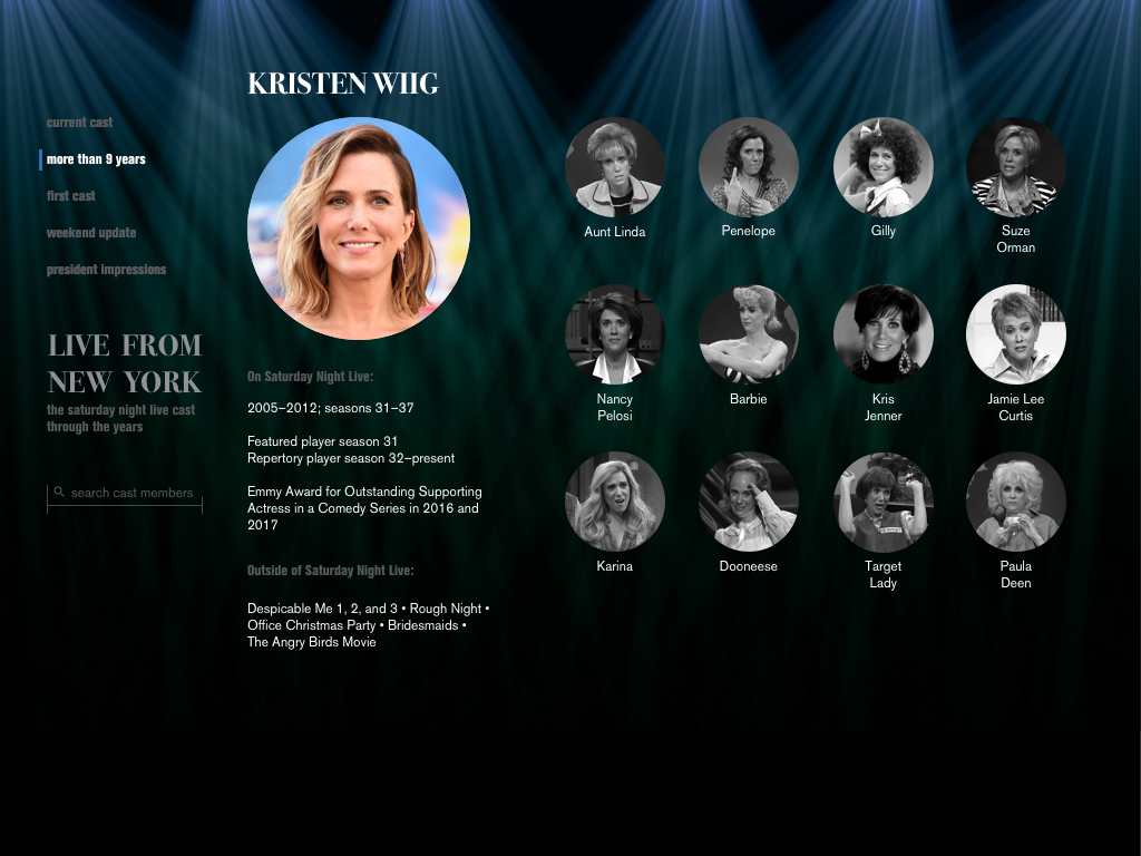
While working on the infographic, it became clear that there was a lot of potential to communicate the information in an interactive medium. I outlined a clear set of product specifications to guide the design of the application and help make relevant design decisions.
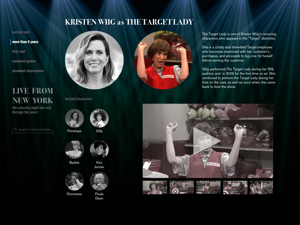
The audience of this website is SNL fans who are familiar with specific eras of the show, whether the first cast, the current, or a few in between.
The content will be bios of cast members and their characters. It will also include pictures to supplement both cast member and character information, and videos of notable sketches that relate to each.
The context of this website is the idea that fans can use it during commercial breaks on Saturday Night to supplement their watching experience. The show would have ads about the app and it together, the two will create a more integrated environment where fans can explore content.
The immediate outcome is to allow fans to learn more about their favorite cast members. The intermediate outcome is to invoke nostalgia in fans who are familiar with previous casts. It will also introduce users to cast members that they are unfamiliar with. The ultimate outcome is to encourage fans to discover and watch (or rewatch!) seasons that they are less familiar with.
Initial Wireframe Ideation for Interactive Application
The first step was the sketch different ways to adapt the infographic into an application. Switching from print to an interactive medium allowed me to reintroduce more specific details about the cast that wouldn’t fit on a poster. Part of this exploration was sketching different combinations of information to reintroduce.
The wireframes were then digitized to allow for more precise wireframes and the exploration of potential interactions.


Mockups + Prototype
The wireframes were then further developed into high fidelity mockups that adapt the visual system of the infographic to the needs of the application.
The mockups were then used to create a functional prototype in Framer.